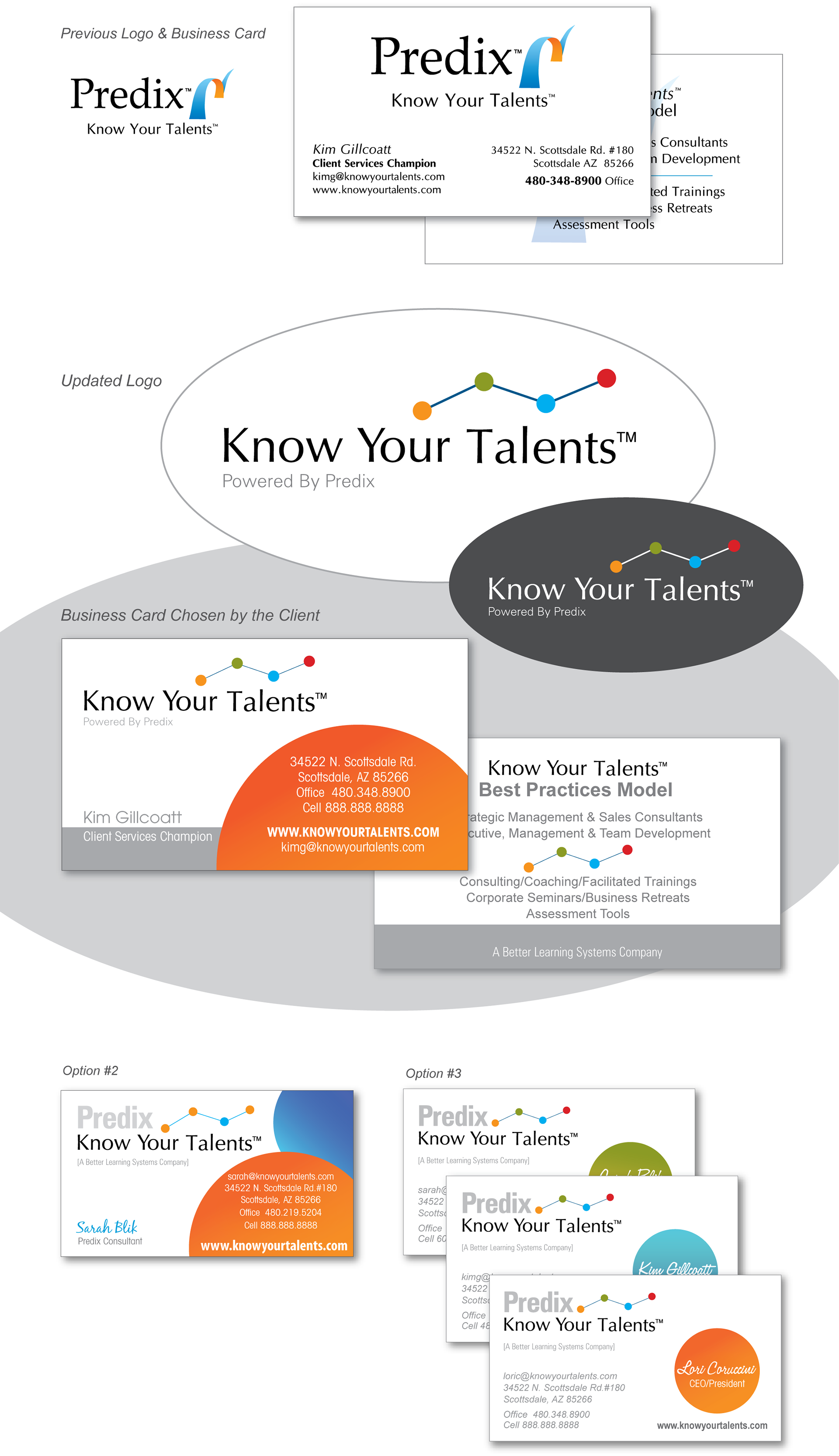
I approached the CEO of our new sister company with and idea for upgrading her logo. In the course of the conversation we came to the conclusion that we needed to focus the branding on Know Your Talents as opposed to Predix due to trademarking issues.
Know Your Talents is an amazing company that delivers a complete analysis of your employees, based on behavior. This analysis is charted in a graph with lines and dots. The language of the company is often "When I see you I see your dots".
Taking all of this into consideration the blue and orange swoosh was swapped out for a more colorful and appropriate graph with dots. Know Your Talents was kept in tact in the same font with the mention of Predix taking a secondary seat at the bottom.
A new color scheme has been set along with a new bold graphic style.